
Prototype preview appears below for mobile review.
Case Study / Field Sales Operations App
OWS Drive
A mobile-first operations dashboard designed to help telco field and internal teams access performance, points, updates, service shortcuts, and daily activity context in one simple interface.
Category
Field Sales Operations App
Role
UI/UX Designer
Tools
Figma, Next.js, TypeScript, Tailwind CSS
Year
2026
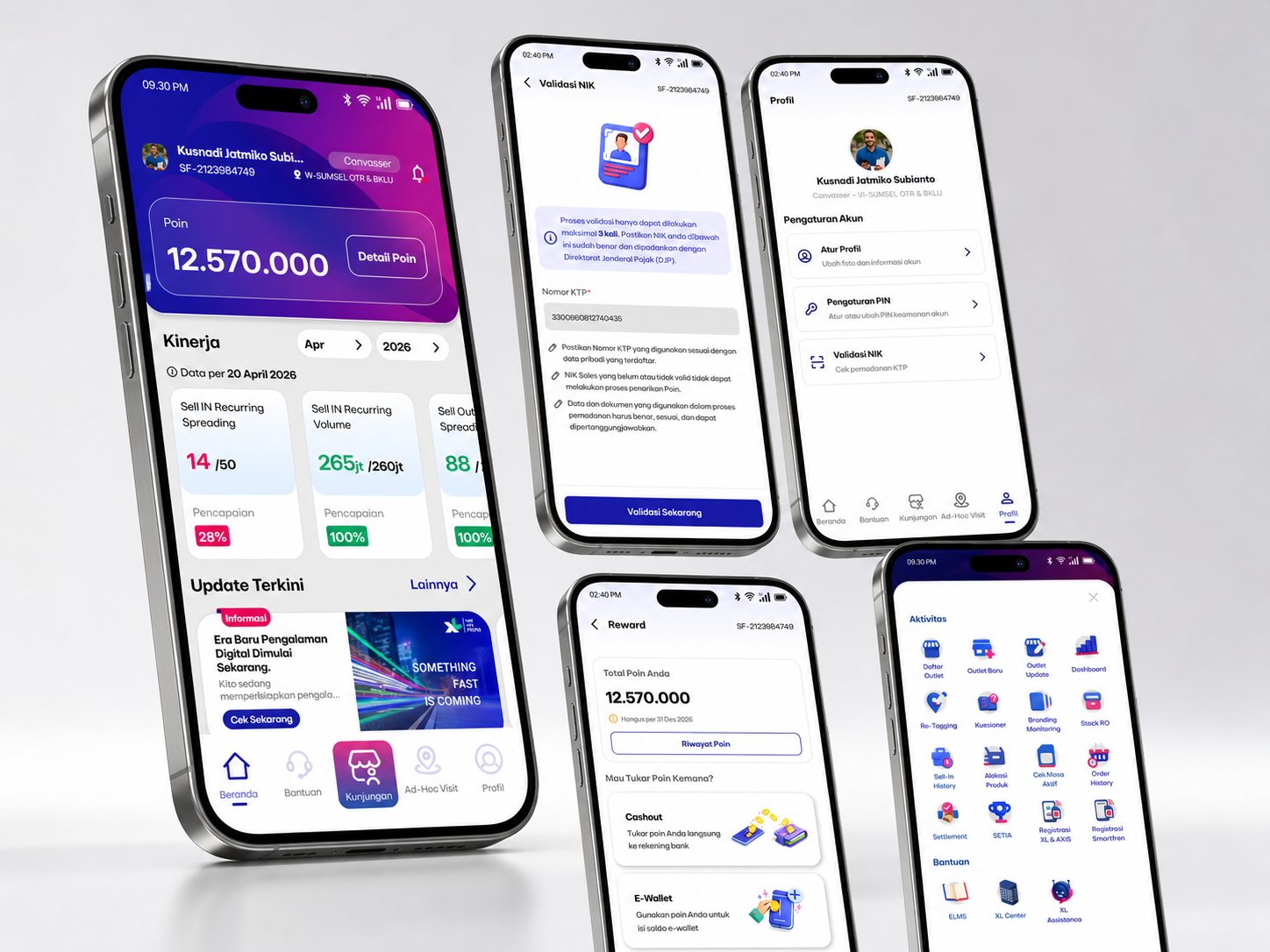
Prototype preview appears below for mobile review.
Project Overview
Overview
OWS Drive brings key field sales and operational information into a compact mobile dashboard. It helps users monitor performance, check points, access daily updates, and navigate service-related features faster from a single mobile interface.
Product Context
Where the concept fits
OWS Drive is designed as a mobile operational dashboard for telco field users. The concept is similar to Salesforce-style field enablement platforms, where users need fast access to performance, activity, updates, and service-related actions in one place.
Problem
The field workflow gap
Field users often need to switch between multiple tools or menu layers to access performance, activity, updates, and operational services. This creates friction during daily work, especially for users who need fast access while working in the field.
Role
What I handled
Responsible for defining the mobile dashboard structure, user flow, visual layout, information hierarchy, interaction behavior, and prototype presentation.
As the UI/UX Designer, I shaped the home dashboard hierarchy, grouped operational content into readable mobile sections, refined the shortcut flow, and prepared the prototype experience for case study presentation.
Product / Design Process
How the concept was shaped
Mapped the field information users need most often, including profile context, points, KPI summaries, updates, service shortcuts, and daily activity signals.
Prioritized a mobile-first home structure so operational users can scan key information quickly without moving through deep menu layers.
Designed the dashboard sections, shortcut hierarchy, bottom navigation, and prototype behavior, then refined the presentation for responsive portfolio review.
Solution
The product direction
The prototype simplifies the field user experience through a mobile-first dashboard that combines profile information, points tracking, KPI summaries, latest updates, quick menu shortcuts, service access, and bottom navigation in one focused interface.
Target Users
Who it supports
Use Cases
What users can do
Key Features
What the experience includes
Design Approach
Mobile-first operational clarity
The interface is designed with a mobile-first approach, focusing on quick scanning, simple navigation, compact information grouping, and easy access to high-priority operational menus.
Design Decisions
Why the interface is structured this way
01
Mobile-first structure
Designed for users who need quick access from a handheld device during daily field work.
02
Prioritized operational shortcuts
Frequently used menus are placed closer to the home screen to reduce navigation effort.
03
Compact KPI cards
Performance information is summarized into simple cards for faster scanning.
04
Bottom navigation
Core areas are placed in bottom navigation to support easier thumb reach and faster switching.
Tools
Tools & Technologies
Frontend
Design
AI Assistance
Impact
Outcome
The prototype helps users scan daily priorities faster, reduce unnecessary navigation, and access key operational menus with fewer steps. It also provides a clearer foundation for validating mobile dashboard flows before full development.
What I Learned
Reflection
Operational products work best when the first screen respects field context: users need clear priorities, obvious shortcuts, and only the information that helps them decide what to do next.
Other Projects
More selected work
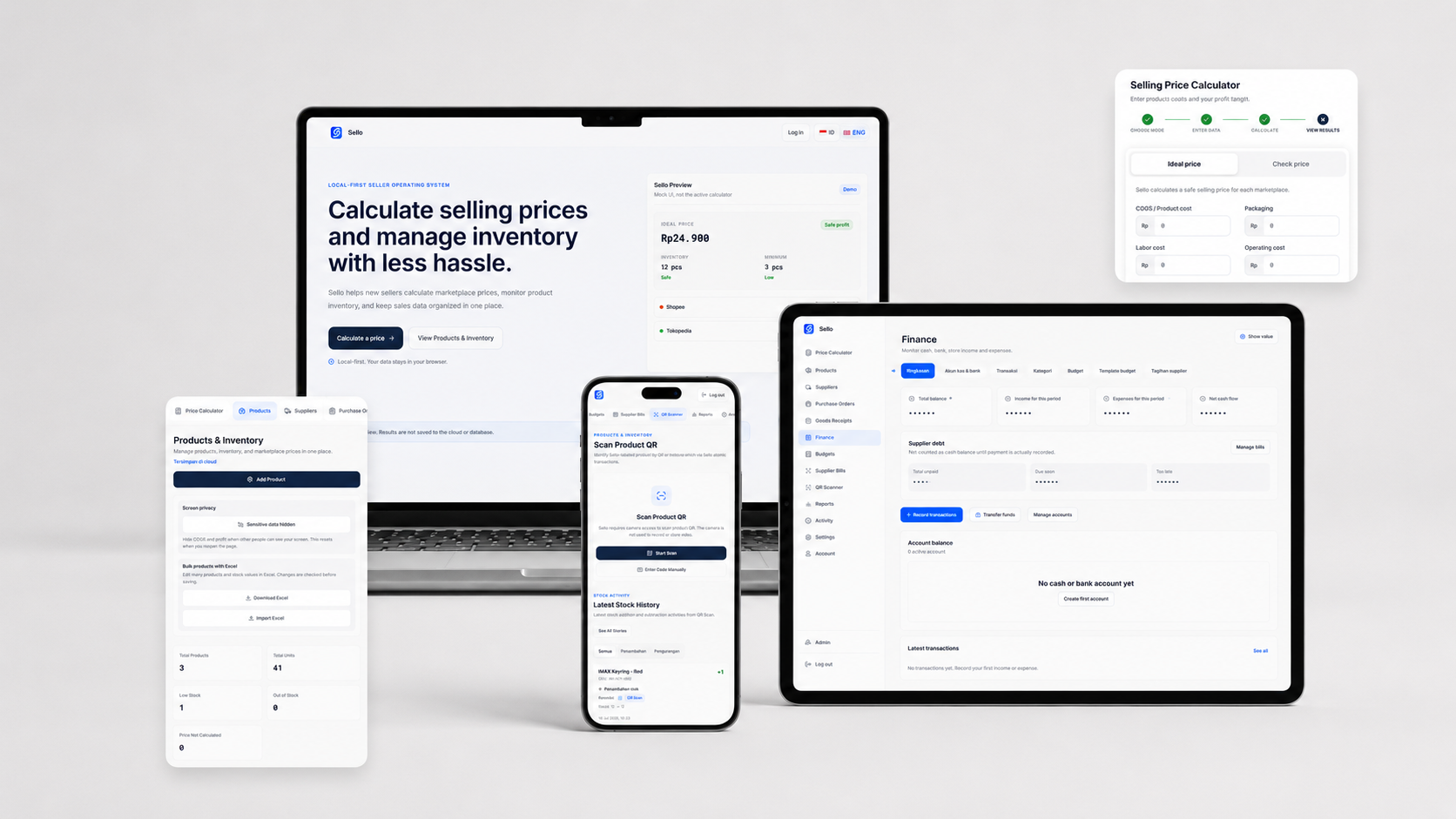
Product Design · Full-Stack Development
Sello — Seller Operations System
A lightweight, cloud-based Seller Operations System for Indonesian online sellers.
View Case Study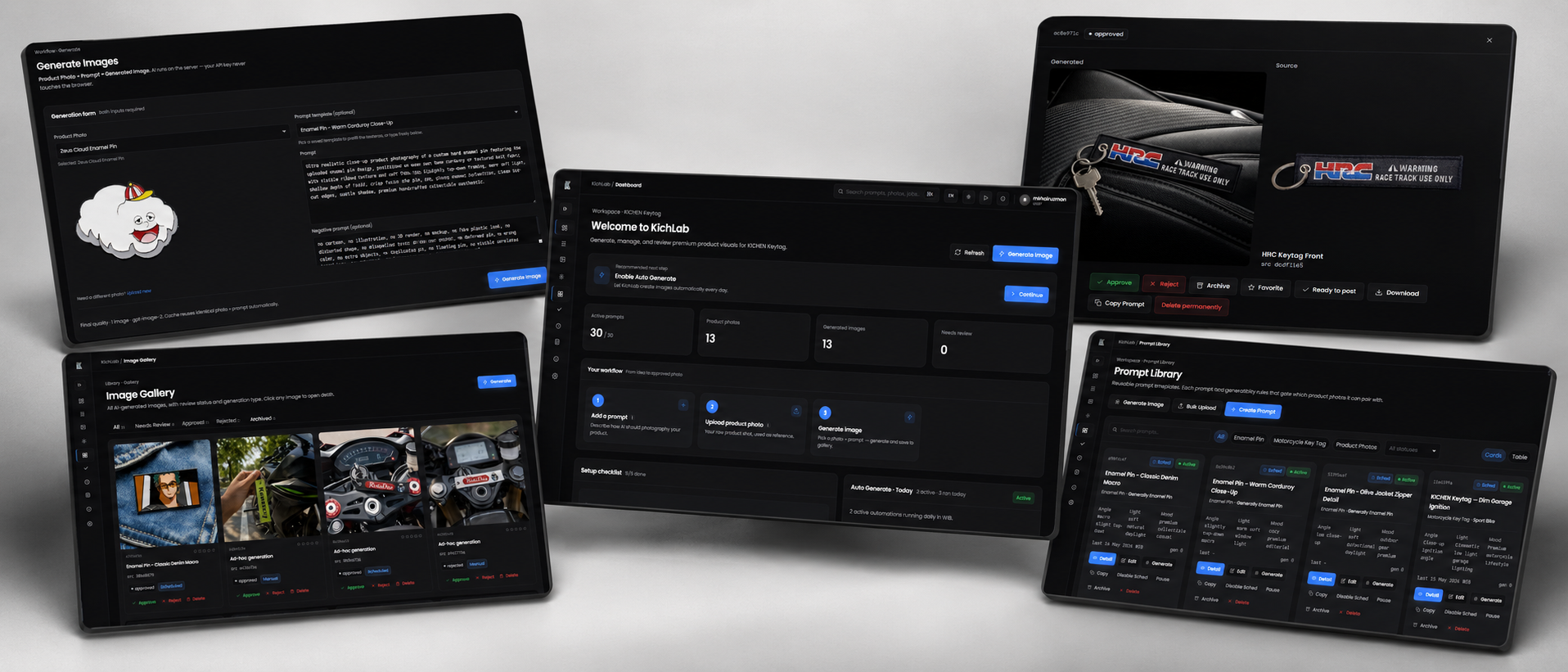
AI Content Generation Tool
KichLab
An AI-powered creative automation tool designed to help business owners generate product content automatically through prompt libraries, category-based workflows, and scheduled AutoGeneration.
View Case Study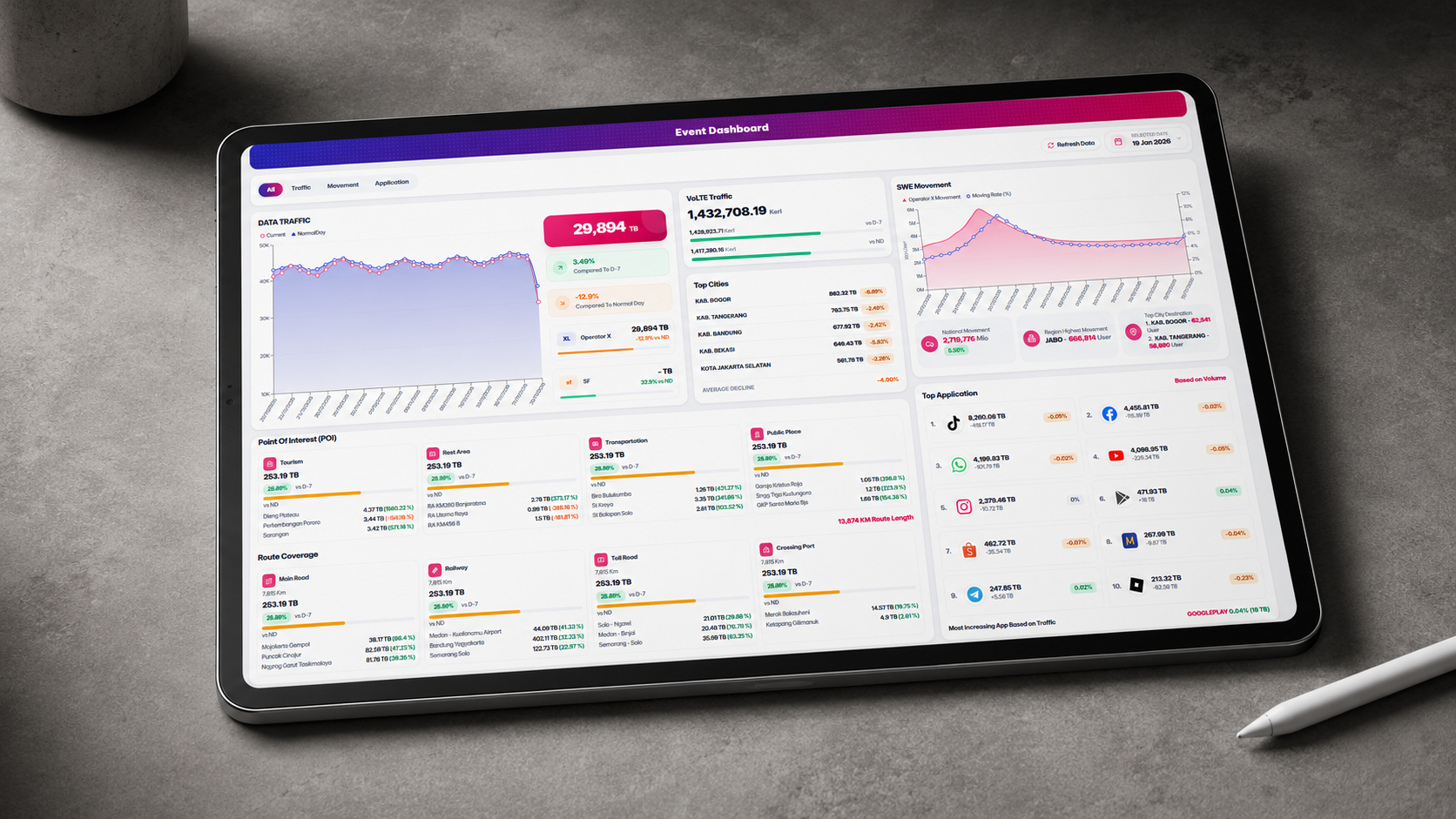
Analytics Dashboard / Telco Operations
Event Dashboard
A responsive event monitoring dashboard for visualizing traffic volume, movement, POI activity, route coverage, city performance, and top application usage in one executive-ready interface.
View Case Study